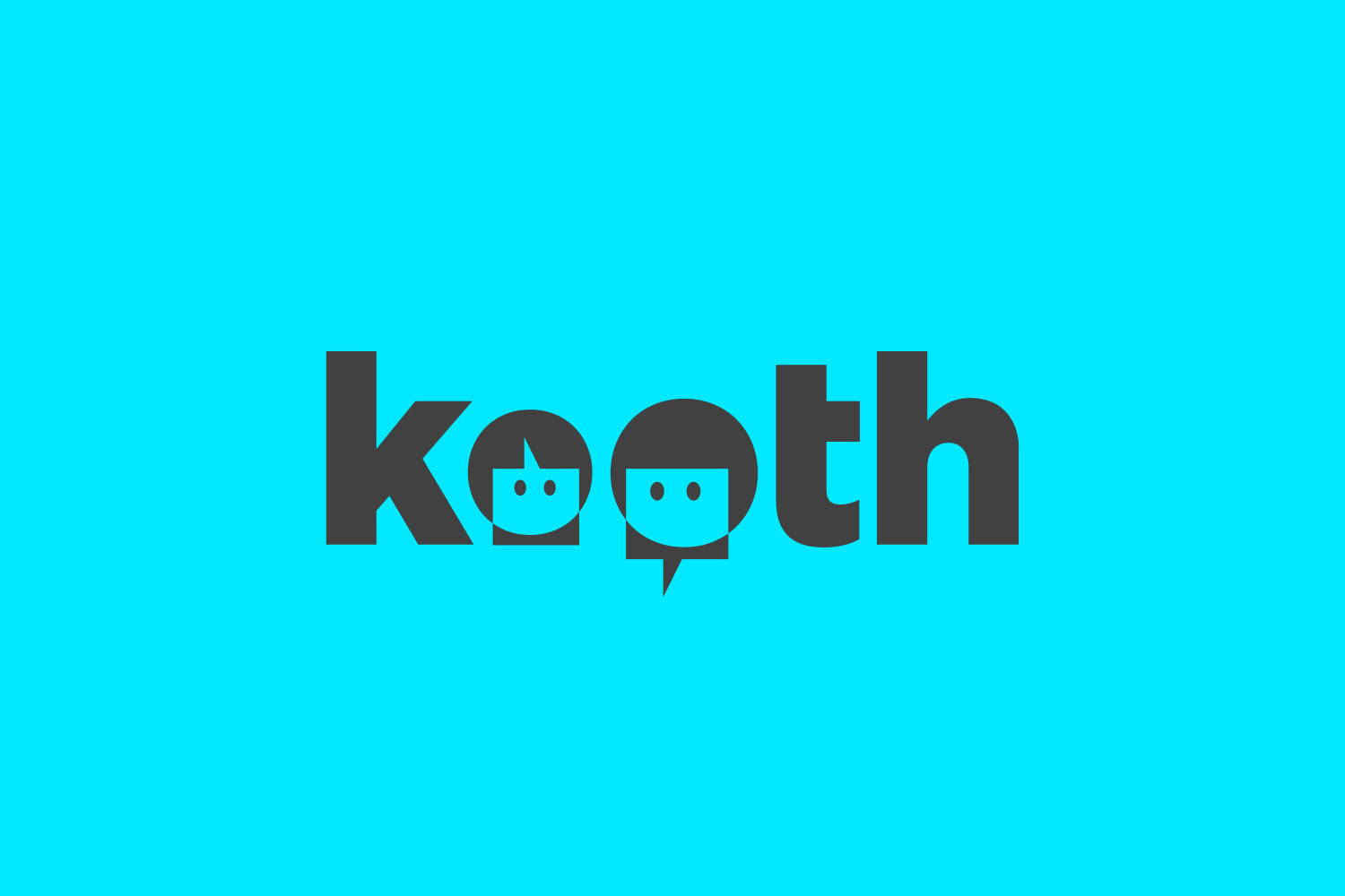


KOOTH is a unique service that provides vulnerable young people, who have emotional or mental health problems, with support when they need it most. Offering online counselling to young people aged 11-23, Kooth engages with hard-to-reach young people in a way that other services can't – counselling services via an online chat platform.
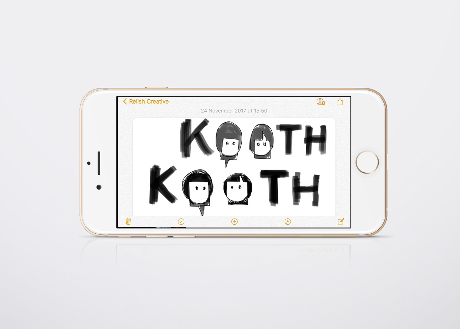
Relish briefed me to develop the brand identity. As the service was designed to reach young people using online chat, I thought the iconography of emoticons and speech balloons that appears in most social chat apps was the right direction. The idea came to me to take the 'double O' in KOOTH and to personify them. I thought I'd add two speech balloons to show communication and realised the chat icon overlaid and turned upside-down on one 'O' looked like a young persons hair parting and the other way round looked like a shirt a professional councillor or a young adult may wear. This also allowed the double O device to be used on it's own as a icon. While on the tube I quickly sketched the idea on Notes on my phone (a modern version of a napkin) as can be seen above.
The logo was further developed and in order to appeal to a diverse, younger audience, Relish found flexible use of colour added the casual playfulness the brand needed to communicate to its target audience.
________________________________
CLIENT: RELISH CREATIVE
CREATIVE DIRECTOR: Marc Aird-Mash
CLIENT: RELISH CREATIVE
CREATIVE DIRECTOR: Marc Aird-Mash
